
Mobile First Design
Mobile first design services that put the smallest screen first: fast, thumb-friendly, responsive experiences for apps, websites and PWAs that scale up to every device.


Our mobile first design services start with the smallest screen and scale up. Every experience is planned around real mobile behavior, meaning one hand, short sessions and unreliable networks, then enhanced for tablets and desktops without losing what makes it work on a phone.
Our Core Capabilities
How We Design for Mobile
Our Mobile First Design Services for Apps, Web & PWAs
Most of your visitors meet your brand on a phone, so we design for that moment first. Our mobile first design services shape focused, fast and easy-to-use experiences for apps, websites and progressive web apps, then scale them up to tablets and desktops without losing what makes them work on a small screen.
Mobile-First App Design (iOS & Android)
App interfaces designed for one-handed use, clear navigation and quick tasks, so people reach their goal in a few taps.
Bottom navigation, generous touch targets and short paths to the most common tasks.
Interface patterns that feel at home on both iOS and Android.
Mobile-First Website Design
Websites and landing pages designed for phones first, then enhanced for larger screens, so the version most visitors see is the best one.
Layouts built for the smallest viewport, then enhanced as space grows.
Clear hierarchy and fast pages that suit how search engines evaluate the mobile version of your site.
Responsive & Adaptive Design
Flexible grids, fluid typography and tested breakpoints keep layouts consistent and readable across phones, tablets, foldables and desktops.
Flexible grids and fluid typography that stay readable at every size.
Layouts checked across phones, tablets, foldables and desktops.
Performance-First Design
Lightweight layouts and considered loading states, designed with Core Web Vitals in mind so pages feel quick on mid-range phones and slow networks.
Optimized imagery and lean components that keep pages fast.
Skeletons, placeholders and progressive loading that make waits feel shorter.
Progressive Web App (PWA) Design
Installable, app-like web experiences with offline states and notification patterns, so you can reach mobile users without an app-store release.
App-like web experiences users can add to their home screen.
Designed offline states and notification patterns that keep users engaged.
Mobile UX Audit & Redesign
We review your current site or app on real devices to find tap-target, navigation, speed and layout problems, then redesign the experience in order of impact.
A hands-on review that finds problems emulators and desktop previews miss.
Fixes ordered by impact, so the biggest improvements ship first.
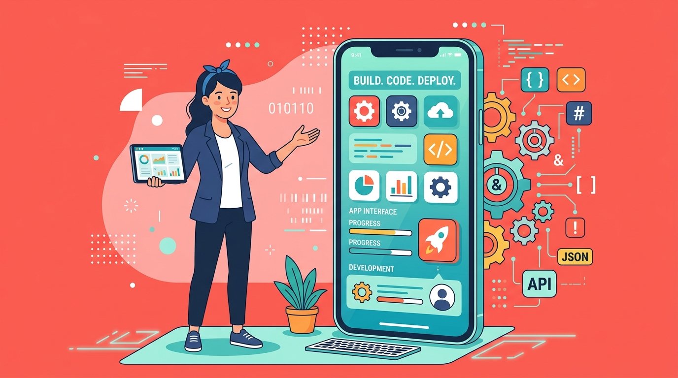 Mobile Workspace
Why Partner with Us for Mobile Success

Mobile First Design Across Key Industries
Mobile use looks different in every sector: a shopper in a hurry, a patient booking on the go, a driver in the field. We design for the moments that matter in yours.
We Know What Makes Mobile Experiences Work
From the first wireframe to the final device test, our designers start with how people use their phones: quickly, one-handed and often on the go.

Why Teams Rely on CodeBase Coders
for Mobile First Design
Our designers focus early on what tends to break on small screens: cramped layouts, hard-to-reach controls and pages that load slowly. Built into every project, this approach helps you avoid costly rework after launch.
Mobile-First Thinking
We start with the constraints that matter most, a small screen, one hand and an unreliable connection, so priorities are clear before the design grows.
Touch-Friendly Interaction
Navigation, buttons and gestures are designed for thumbs, with comfortable targets and clear feedback, and checked on real devices.
Performance as a Design Requirement
Performance budgets, lightweight layouts and thoughtful loading states keep experiences fast on mid-range phones and slower networks.
One Design System, Every Screen
A shared component library scales the mobile design up to tablets and desktops, so every breakpoint feels like the same product.
Real-Device Validation
Prototypes and builds are tried on real phones and tablets for touch, readability, speed and accessibility before anything is signed off.
Turn Your Product Into A Mobile-First Success.
Our Mobile-First Design Approach
From Small Screens to Every Screen
Mobile-first is a strategy, not just a set of breakpoints. We start with the toughest constraints and add space, features and polish only where a larger screen can support them.
Design for the Smallest Screen First
We begin with a small screen, one hand and an unreliable connection. Those limits force clear priorities, so only what users truly need earns a place on the page.
Adapt Layouts for Tablets & Foldables
As space grows, layouts adapt: multi-column grids, side navigation and richer content appear only when the screen can genuinely make use of them.
Enhance Up to Desktop & Beyond
Desktop gets progressive enhancement, not a separate product: hover states, keyboard shortcuts and denser layouts are added on top of a solid mobile core.
Our Mobile First Design
Process That Delivers
Fast, Usable Experiences
We begin by understanding how your audience uses their phones. Every stage is shaped by real mobile behavior and produces deliverables you can review and approve.
Mobile User & Context Research
We study who uses your product on mobile, where, and on which devices and networks, so design starts from real usage instead of assumptions.
We decide what belongs on a small screen, rank features by user value and set a clear content hierarchy before any layout is drawn.
Content & Feature Prioritization
Mobile Wireframes & Navigation
Single-column wireframes and thumb-friendly navigation patterns test the core flows on the smallest viewport before anything else.
The approved mobile design scales up to tablet and desktop with defined breakpoints, fluid grids and one shared design system.
Responsive UI Design & Breakpoints
Prototype & Real-Device Testing
Interactive prototypes are tried on real phones and tablets for touch, readability, speed and accessibility, then refined from what we observe.
Developer-ready specs and assets ship with performance budgets, and we review the built pages against the design and against Core Web Vitals.
Handoff & Performance Checks
We Innovate Mobile Experiences with Next-Generation Technologies
Modern web and device capabilities let us design mobile experiences that are faster, richer and more resilient.
As a mobile first design company, we adopt new device capabilities and interaction patterns with purpose, using them where they make products quicker to use and more dependable on the networks people actually have.
Progressive Web Apps
Installable, offline-capable web experiences that combine the reach of the web with the feel of a native app.
Know MoreFoldables & Adaptive Layouts
Adaptive layouts for foldables and large phones respond to posture and screen size, keeping content comfortable to read and easy to reach.
Know MoreGesture & Voice Interaction
Swipes, long-presses and voice input designed as shortcuts that add speed without hiding essential actions.
Know MoreAI-Personalized Experiences
Interfaces that adapt content and shortcuts to each person, with clear controls so users stay in charge.
Know MoreOffline-First Design
Experiences designed to keep working on poor connections, with clear sync states and graceful recovery.
Know MoreMobile First Design Tools We Are Equipped With
Design, build and performance tools that keep a mobile-first design flexible, testable and fast, from the first wireframe to the finished page.
Mobile Design Built with
Trusted Tools
We design, build and measure with tools that product teams already know and trust.
Explore More
Product Engineering Services
Mobile-first design works best alongside strong UX and solid engineering. Explore the services that pair with it.



Mobile First Design FAQs
Didn’t Find What You Were Looking For?
We’ve got more answers waiting for you! If your question didn’t make the list, reach out directly to our Mobile First Design experts.
Ready to Get Started With Mobile First Design?
Speak with our senior engineers today. Receive a technical roadmap, project plan, and squad proposal in under 4 hours.