
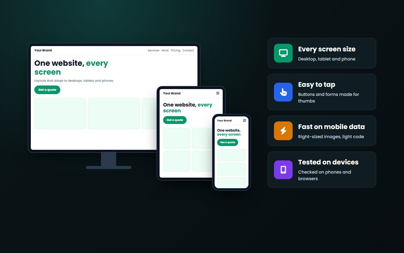
We design and build websites that work on every screen: phones, tablets, laptops and large monitors. Layouts rearrange themselves, text stays readable, buttons are easy to tap and images load at the right size. If your current site looks broken or tiny on a phone, we can make it mobile-friendly without starting from zero.

































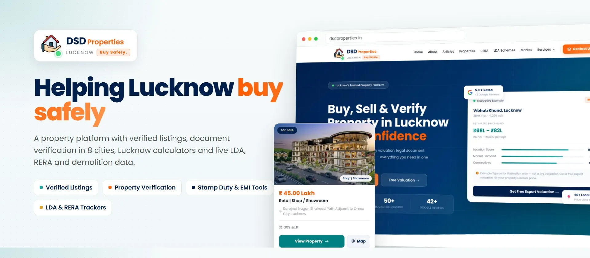
A property platform for DSD Properties in Lucknow. Buyers browse verified listings, book document verification, work out stamp duty and EMIs, and check LDA schemes, RERA projects and demolitions before they buy.

A B2B catalogue website for DXT Trades, a Faridabad supplier of birchwood cutlery, ice cream sticks and sustainable food packaging. Buyers browse 68 products in 6 categories and send an enquiry for any product in one click.

A website for greensac, a Mumbai maker of custom cotton, jute and paper packaging. It presents 22 products in 4 categories, each with material, colour and branding details and a quote button.

A website for Planet Terra, a vegan cafe at The Greens in Dubai. One calm, image-led page tells the cafe's story and takes guests to the food menu, online ordering on Deliveroo and Careem, Instagram and a call.
WHY RESPONSIVE
Your customers switch between phones, tablets and laptops. A responsive website gives all of them the same easy experience, from one site you manage in one place.
Does your website look wrong on a phone? Send us the link.
Chat on WhatsAppWHAT WE DO
From a brand new website to making an old one work on phones, these are the responsive projects we take on.
A new website designed for phones, tablets and desktops from the start.
Learn moreYour current website updated so it works properly on phones.
Ask us about itImages, code and hosting tuned for fast loading on mobile data.
Learn moreCustom or fixed themes that behave well on every screen.
Learn moreProduct pages, carts and checkout made easy on a phone.
Learn moreDashboards and portals that staff and customers can use on the go.
Learn moreAd landing pages built for visitors who click from their phones.
Learn moreNewsletters and alerts that read well in mobile mail apps.
Ask us about itA review of how your site works on phones, with fixes listed.
Learn moreNot sure whether to fix or rebuild your site? Send us the link for a free review.
Get a free review on WhatsAppHOW WE WORK
We design for the smallest screen first, then build up, and test on real screen sizes before anything goes live.
Your current site, visitor devices and mobile problems listed.
Phone layouts designed first, then tablet and desktop.
Flexible layouts, responsive images and touch-friendly forms.
Every page checked on phones, tablets, browsers and for speed.
Go live with redirects in place, then check Search Console.
Step one is a free call or website review. Send us a message to book it.
Book a free call on WhatsAppCHOOSING AN APPROACH
Some older businesses run a separate mobile site, often on an m. address. A single responsive site is now the standard approach, and here is why.
Still running a separate m. mobile site? Ask us about moving to one responsive site.
Ask on WhatsAppWHY CODEBASE CODERS
What you can count on in every responsive project.
We design the phone layout first, because that is where most visitors are.
Property, packaging, supplier and cafe websites we built work on every screen.
If your site can be fixed, we fix it; if a rebuild is cheaper, we say so.
Code, design, content, domain and hosting stay in your name.
Pages, devices tested, timeline and payment stages fixed before work starts.
Updates, fixes and new pages that stay responsive.
Talk to the team that will design and build your website.
Chat on WhatsAppFAST AND USABLE
Fitting the screen is only the start. A good mobile website is also quick to load and easy to use with one hand.

Is your website slow on mobile? Send us the link for a free speed check.
Get a free review on WhatsAppPRICING
Fixing the layout of a small site and building a new responsive store are very different jobs. These six things decide most of the price.
Updating a site is often quicker; very old code may need a rebuild.
Each unique page layout needs designing and testing on every screen.
Forms, filters, sliders and checkouts each need mobile versions.
Resizing and converting many images takes time.
More devices and browsers mean more testing.
Domain, hosting and support are paid every year or month.
Our website cost guide shows typical ranges in India, and the calculator gives an estimate in about a minute.
A few lines about your business and what you need. We reply the same working day (India time).
Tell us about your business and your customers. We will suggest what to build, roughly what it costs and how long it takes, free.
Tell us what your business needs. We will suggest the simplest way to build it and share a free estimate.
Tell us what your business needs. We will suggest the simplest way to build it and share a free estimate.
No forms to fill. Send us a message about your project and talk directly with our team.

